
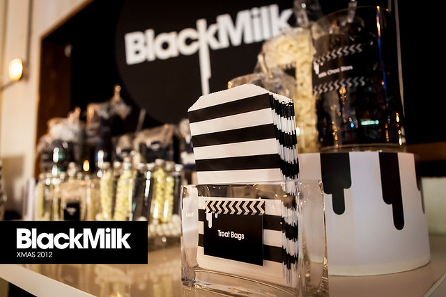
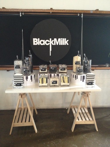
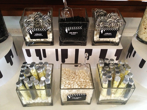
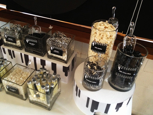
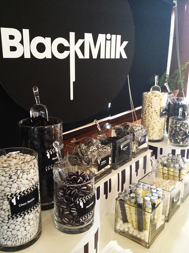
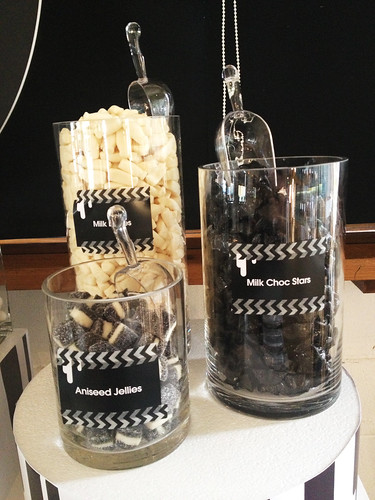
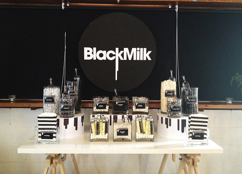
Black Milk's logo is so clean and graphic I knew at once I wanted to create a table that reflected those elements. I chose to use cylinder and cube shaped vases instead of traditional lidded jars. To compliment the logo I used the same "running paint" graphic that is in the logo on the risers. The jar labels where adhered with black and white chevron washi tape. Even the table I chose had an industrial feel to it that complimented both the brand and venue.
I hope you enjoy the photos.


Looks fabulous Sharnel, really love the clean and uncluttered look.
ReplyDeletetruly love this xx
ReplyDelete